Shelby Temples on why you don’t have to struggle for your work to mean something
An interview with a designer who became a finalist in Janet Jackson's album cover contest at age 15 and was one of our personal favorites for Websites of the Year last year.
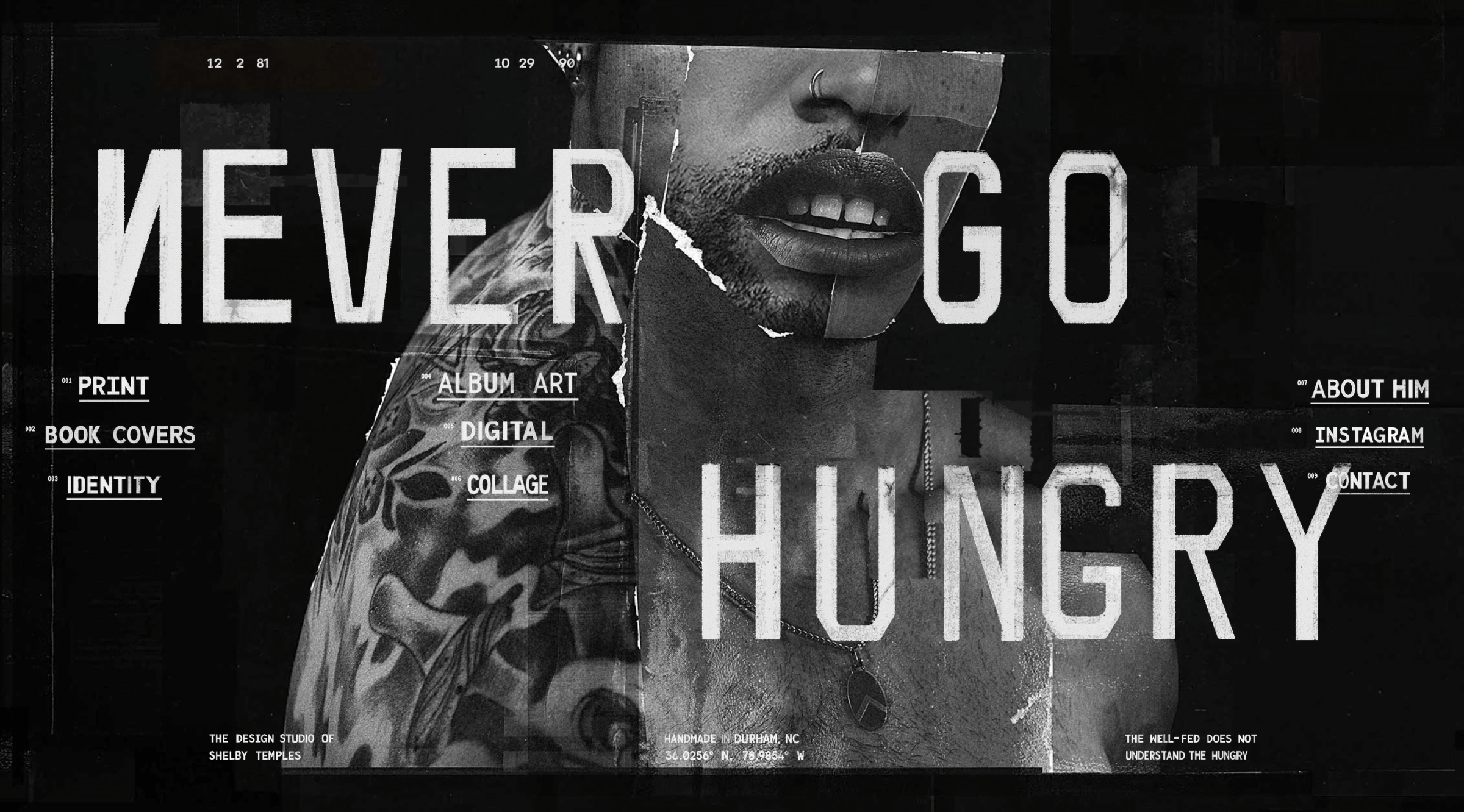
Designer Shelby Temples was born and raised in a small Mississippi town with “about a dozen stoplights.” Despite this, he became a finalist in Janet Jackson’s album cover contest at age 15 and was one of our personal favorites for Websites of the Year last year. We talked to Shelby about why collage is so important to him, how queerness helped him see his value as a designer, and why increasing your prices only attracts the right clients.

On the name
Growing up, I always knew I wanted to do something creative. I wanted to work with colors and images, to create something that didn’t exist before. But “designer” is just a blanket term, much like “artist”—I think they’re synonyms. Anybody who’s creative is an artist.
The name of my studio, “Never Go Hungry,” comes from a Courtney Love song. The song references a phoenix rising from the ashes, and each time she sings the line “I will never go hungry,” it’s followed by “again,” serving as a constant reminder that where you begin isn’t where you end. Throughout the track, there’s a desperation in her voice, like she’s using her last breath to declare that she’ll keep fighting, like a heroine at the end of an action movie, beaten down by war but delivering a final battle cry. I found the song motivational, and I needed to decide on a design alias. I chose a design moniker instead of my own name because I wanted it to seem bigger than it was at the time. It felt like the right fit, and I still love it.
Hole – “Never Go Hungry”
On collage
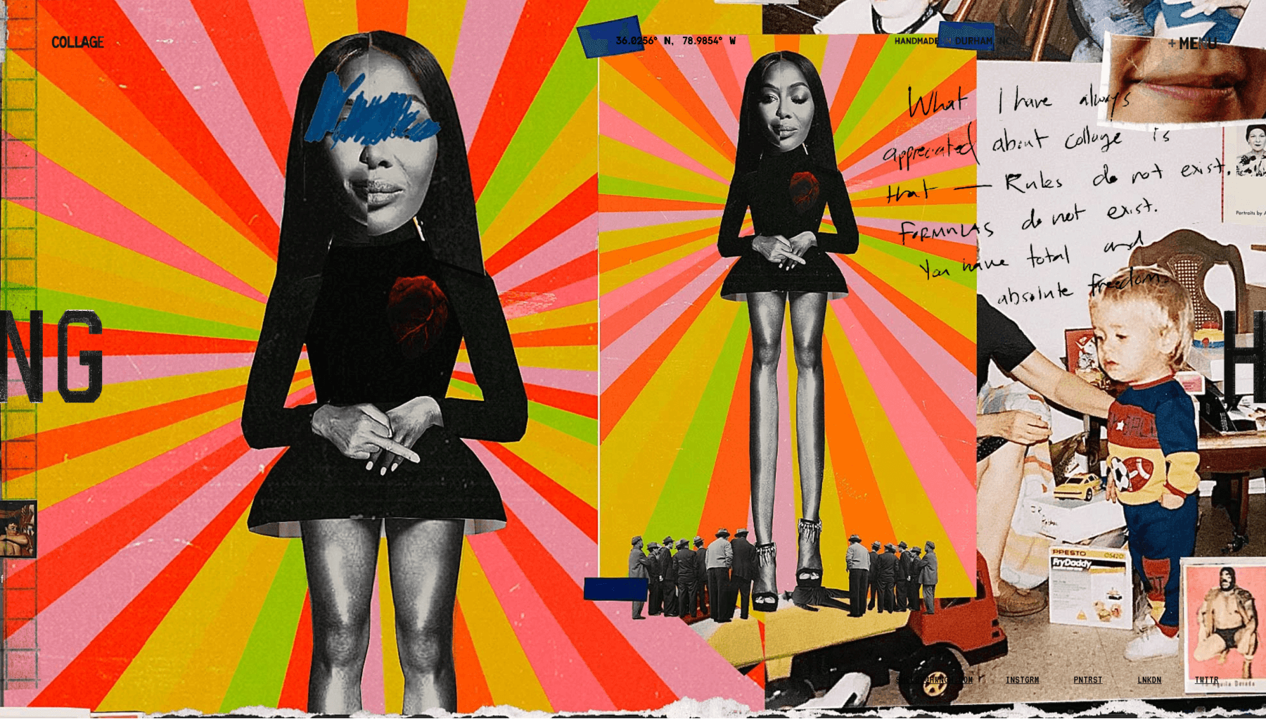
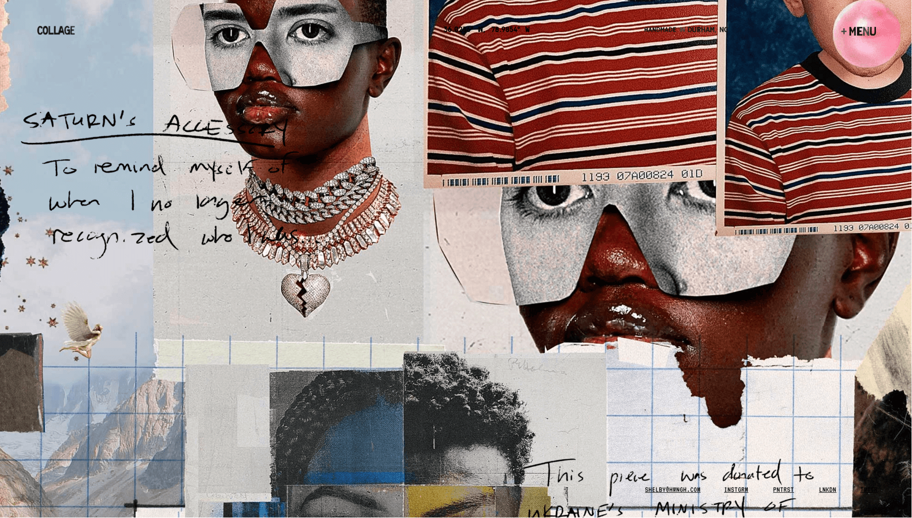
Collage is a technique that excites me and makes me feel alive. It’s probably due to a lifelong fascination with transforming disparate elements into a cohesive whole. I’m drawn to making something new from seemingly unrelated pieces and exploring how fragments can come together to tell a unified story. What captivates me about collage is its ability to reflect that we’re more alike than different. Despite our origins, we share commonalities that bind us together, beautifully illustrated in collage work. It’s both carefree and careful, freeing and precise. It gives the illusion of effortlessness, but it’s a quality you can achieve only through discipline. Everything I create blends spontaneity and control.
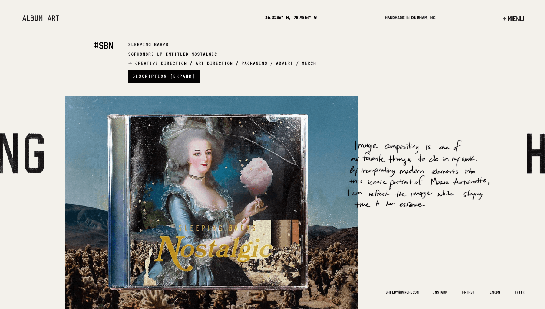
I draw from urban references, landscapes, pop culture, and historical art. One of my favorite pieces in my portfolio is an album branding project called “Nostalgic.” On the cover is an old painting of Marie Antoinette. Originally, she was holding a bouquet of flowers adorned with jewels, and I’ve updated it so that instead of flowers, she’s holding a giant thing of cotton candy, has diamond rings on, and maybe a septum piercing—I’ve forgotten exactly what I did to the image, but it’s one of my favorite pieces.
I’ll say 80% of my work is digital. I have a natural impatience, and physically laying everything out, cutting, and pasting feels too slow for my brain to handle. I like to create something digitally, then print it, cut it out as arranged, and layer it to create a visual texture you can see in person. There’s something about the tactile experience of cutting and pasting I enjoy, but the precision of digital work speaks to me more.
On the balance between fulfillment and survival
Overall, passion is my primary source of motivation, and I’ve resolved never to sacrifice what I’m passionate about. However, financial instability can be highly disruptive to the creative process. When your mind is preoccupied with survival, stress can stifle creativity. I’ve experienced that many times, going through an extended starving artist period. For a while, it felt like it took a lifetime to dig myself out of the cliché of just affording meals and somewhere to live. But life doesn’t work like that, and the older you get, the more you realize it.
I eventually reached a breaking point and knew something needed to change. I remember a client approached me to rebrand their entire identity, starting with a logo and then a landing page. I quoted them triple what I’d previously charged, and they accepted with no objections. Taking that risk was a pivotal moment where I knew I deserved more money.
“Being an artist, you sometimes convince yourself that you have to struggle for your work to mean something, but that’s not true.”—Shelby Temples
When I started to ask for more, I also started getting clients closer to who I wanted to work with. It was a weird thing—asking for more didn’t push people away; it drew them closer.
On selecting clients
My decision on who I work with always comes down to a gut feeling, which has naturally led me to collaborate with more artisanal clients. I’ve always been drawn to what’s local to me because you get a better sense of who someone is when you’re familiar with their environment. That’s not to say you can’t form a connection over Zoom, but there’s an undeniably deeper connection when you share a physical space. Clients want to be seen and understood, and that starts with finding a designer who genuinely cares.
At the same time, there’s a responsibility on the designer to know when a client or project is the right fit. I’ve made the mistake of taking on projects that weren’t in my wheelhouse, partly to challenge myself because I consider myself a fearless person. I don’t run away from challenges, and I’m not afraid of trying new things. But when something isn’t right, it just isn’t right. I’ve also taken on projects because the money was too good to pass up. In most of these instances, you struggle to get through the project because you’re not on the same page and can’t connect in the way you need to. It’s better to go with that gut feeling.
I’ve had projects that were disastrous, and sometimes you just forfeit out of conscience, recognizing it isn’t working. However, you also have to be fair to yourself and realize that once you’ve done the work, it’s done. As long as you’re doing your best, you have a responsibility to the client to deliver, but also to yourself to provide your knowledge and experience. It’s similar to going to a restaurant: if you don’t like the meal, should you not pay for it just because it wasn’t what you expected?
On self-acceptance
The queer community has greatly influenced my work because they resonate with the journey for authenticity and acceptance. Queer individuals often start by seeking acceptance from others and looking for validation. I remember being in that mindset, wondering why people couldn’t see my value. It was a feverish pursuit that ended in feeling disconnected. That journey of self-acceptance teaches you a crucial lesson: it comes from within. It might sound like a cliché, but accepting yourself is the real goal.
Queer themes in my work aren’t just about representation; they’re about celebrating diversity, challenging norms, and advocating for a world where everyone is free to express themselves however they want.
“Ultimately, if I could be known for one thing with my work, it would be that it’s a testament to the power of self-acceptance and the importance of visibility.”—Shelby Temples
Self-acceptance is similar to how you view your work as a designer. I’ve always been okay with people not liking what I create, and I’m okay with people not liking me for who I am as long as they know who I am.
On portfolio
I was working on my website for so long—probably around seven years. The reason is that I could never create the site I wanted. This goes against every piece of advice a designer would give you: just put something up, get clients, make money, then focus on the site. But until it felt right, I couldn’t put it out.
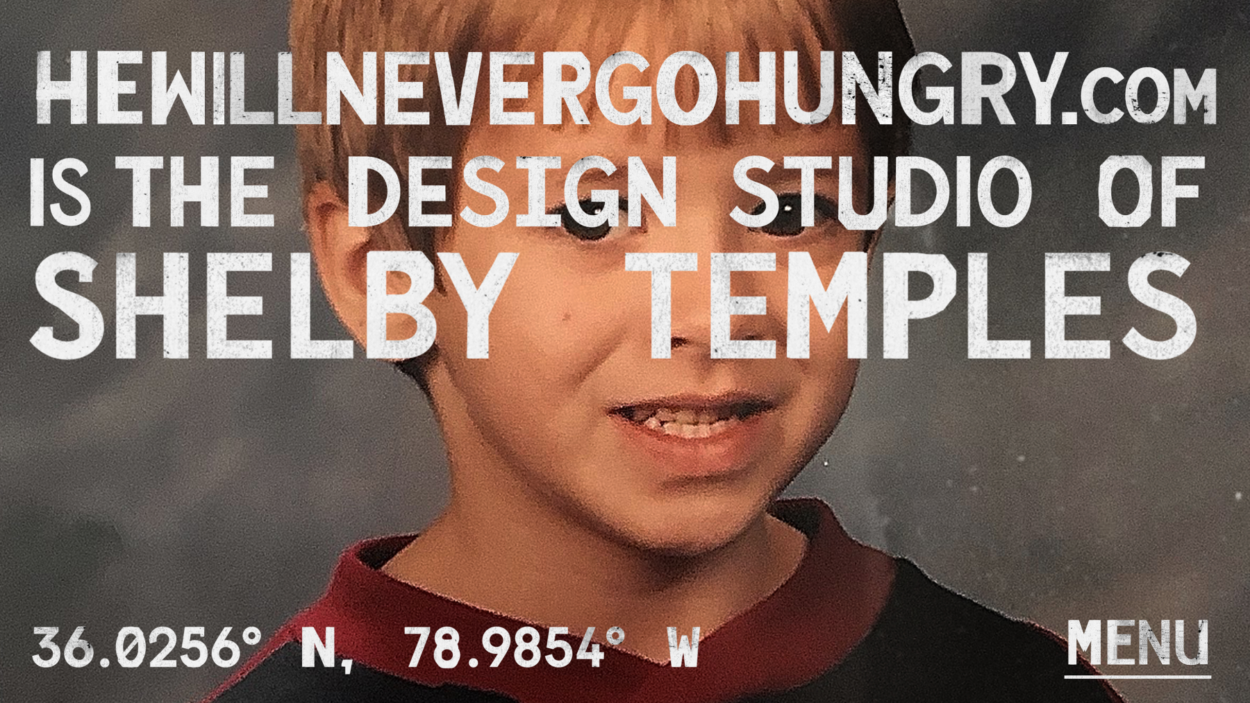
When I started using Readymag in 2020, I realized I could do so much that I ended up doing too much. The process involved building the site, scaling it back, adding things, testing it, and getting feedback. People found it too confusing, so I scaled back again. It was a good problem to have, being overwhelmed with options instead of disappointed by them. Readymag changed my life. Once I got the portfolio up, there was a complete turnaround in my career. I landed some of the biggest clients of my career, started being recognized by podcasts, and received emails praising my website. It was crazy because I had this blind confidence that things would work out, even without a clear plan.
Everything finally fell into place. Not just clients, but junior designers started emailing me for advice on getting clients and building a site on Readymag. It’s the only tool I recommend to creators. I champion creating a website that’s different. I always say “Avoid the grid” and do something unique, because people only look at your website for a few seconds. Interestingly, people stay on my site for an average of a minute and a half, which is substantial for a website visit.
On the Janet Jackson album cover
It was around 2006 or 2007. I was a junior in high school, maybe 10th or 11th grade. Janet Jackson posted on her website that she was coming out with a new album and there was going to be a worldwide contest for four alternate album covers. The label would provide one official cover, and the four contest winners’ covers would each be printed on about 50,000 copies. They provided a package of 30 or 40 images with very little design direction. Their only request was to put the name of the album on the cover.
I had this blind confidence and thought, “I’m going to win this.” I wasn’t very knowledgeable about Photoshop or layers at the time, but I was really getting into collage. I repurposed one of her iconic images, added angel wings, adjusted the colors a bit, and submitted it. There was an incentive to share the design on social media, and back then, MySpace was the main platform. Sharing the link on MySpace helped increase traffic to the design, moving it up in the rankings.
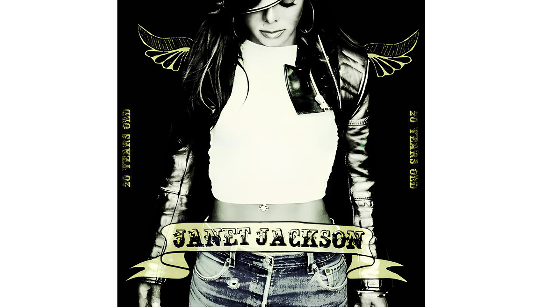
Long story short, they reached out to me. It was a quick interview. They asked about my design process and some legal questions. They asked if I was 16 years old, which was a requirement for the contest. I was actually 15 and told them so. There was an awkward silence, and they said they would call back. When they did, they said they couldn’t select me because of my age. It wouldn’t be fair to others who might have participated if they knew they had to be 16.
What happened with the contest reassured me that I was on the right path. If Janet Jackson approved of what I was doing, then I must have been doing something right. Maybe one day I can design an album cover for her now that I’m an actual legitimate designer. You never know—it could be a flare in the air, and she might see it. It could lead to something.